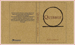
More variations of the sandpaper book cover
Ive decided to go with these book cover for my final design.
I just need to place the barcode on the book to complete this.
I believe my book works well, It has texture that represents their travel through the dessert, the symbol i have chosen to use is the Shen Ring, this means Eternity and Protection, in the story the symbol represents the part when Thoth offers Dan the chance to become imortal, and throughout the story they protect him as the evil Loki is trying to use him to gain access into his universe that he was removed from.
This is my first trial at the website, however on the website about the information about where u can get the book from is miising as there was no room with this design, it would need to be a two page website and i would just have the symbol and the text in the middlle with an enter site at the bottom, the big block of type would go on the next page with the publisher info and the to purchasing info.
As the client would like a onepage website i need to reconsider the layout, but Im finding it difficult to lay it out how i would like to see it as there is only so much space.
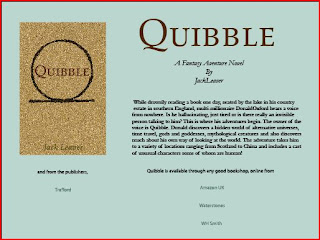
This is my prefered website ,The light colour in the background makes the book cover stand out and not get lost in the information as the old one the client has already was merged together.

Looking back at both of them, this (above) i have decided to go with for my website as its a more earthy colour, and works all in all better visually.
Below is my Bookmark, there wasnt alot of development to this as theres not much u can do with a bookmark with this brief, i think its completed to the best way it could be to fit in with my design.


No comments:
Post a Comment